


Why Eurojust?
Since its establishment, Eurojust grew bigger and more mature. In the near future, it will face new challenges and it needs a new logo design as well as a new organization identity. The creation of new image began with the analysis of the old one:


pictorial symbol cannot function alone too many colors brand claim not included in design typography is too small design is not noble enough
New Eurojust logo should have a more noble form. The most interesting and recognizable symbol which represents law is lady justice - this is why I decided to present her two artifacts: sword and scales. Logo should also relate to European Union, and its rich history of law philosophy. This is why I used symbolism of a column that represents court buildings, and historical aspects of European law. Laurel used in this design is also associated with European culture and symbolizes triumph of fairness. In addition, I decided to find human aspect in the new identification. That’s why the new logo has caring hands as part of scales - visual communication of equity, cooperation and safety.
New logo is inspired by European justice symbols, but it also has a lot in common with other worldwide organizations that fight crime, help people in need, or struggle for human rights.


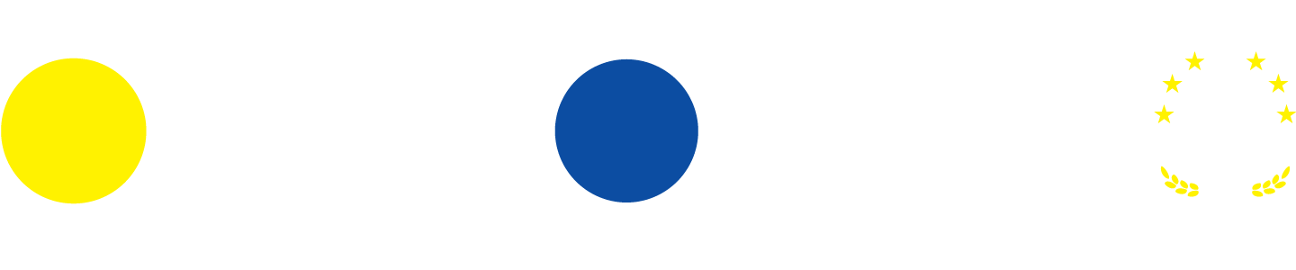
[ pictorial symbol meanings ]
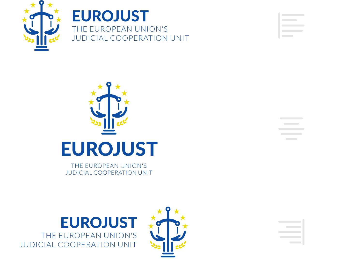

[ logo orientation variations ]
Typography
Lato is a sanserif typeface family designed in Summer 2010 by Warsaw-based designer Łukasz Dziedzic (“Lato” means “Summer” in Polish). In December 2010 the Lato family was published under the open-source Open Font License by his foundry tyPoland, with support from Google.


[ LATO 2.0 font in logotype ]


[ logo free area principles]


[ color schemes ]
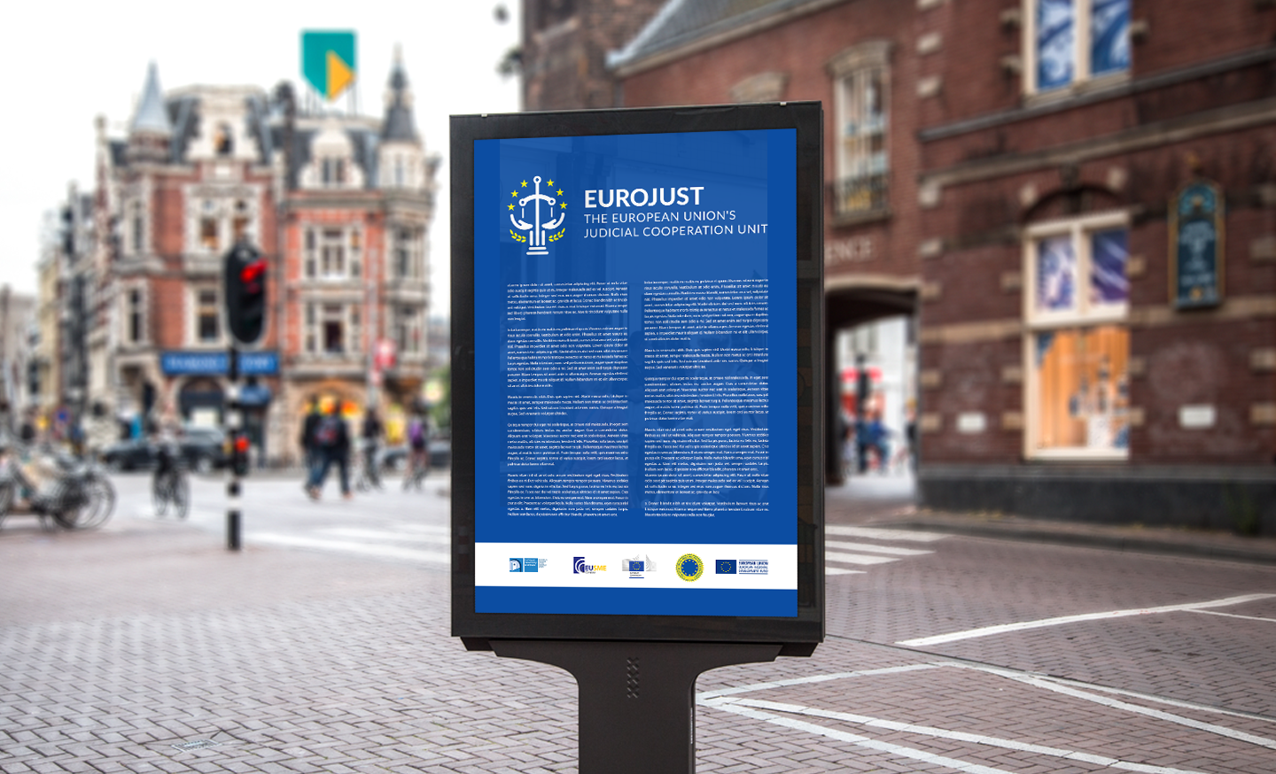

[ logo in use on street citylight]
[ photo copytight: No commercial use. Credit 'graphicburger.com]


[ headquaters in Hague]
[ photo copytight: Lack of information - Google image search resources]
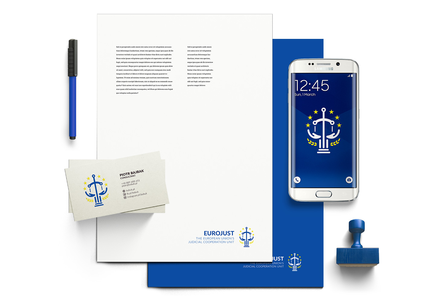

[ branding used on office supplies ]
[ photo copytight: No commercial use. Credit 'creativemarket.com']