





























Topography typography for scouts
Version 1
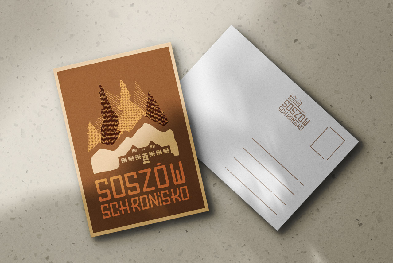
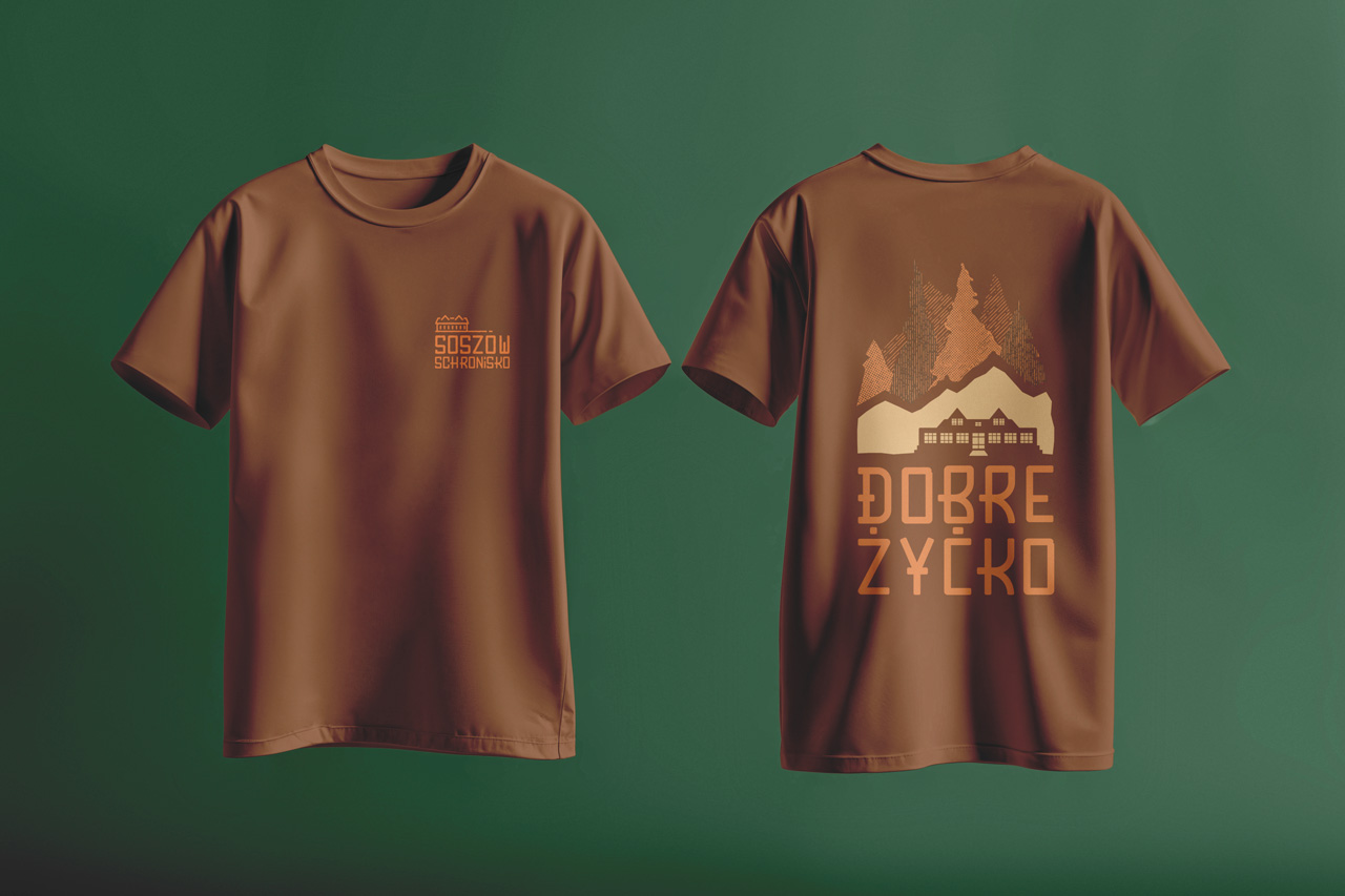
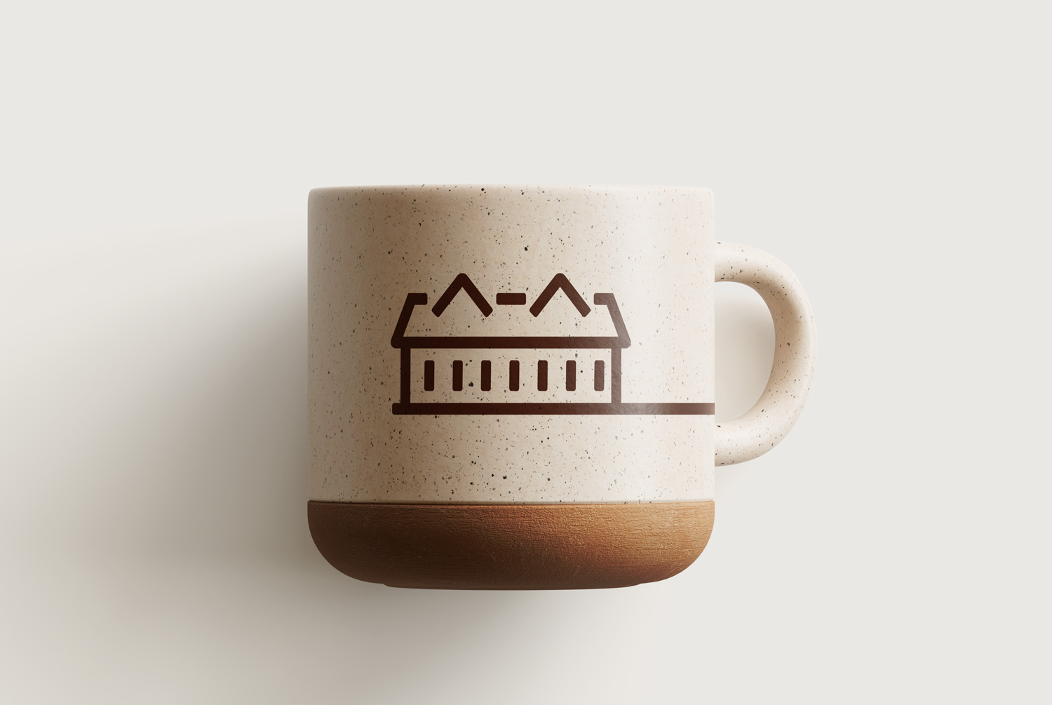
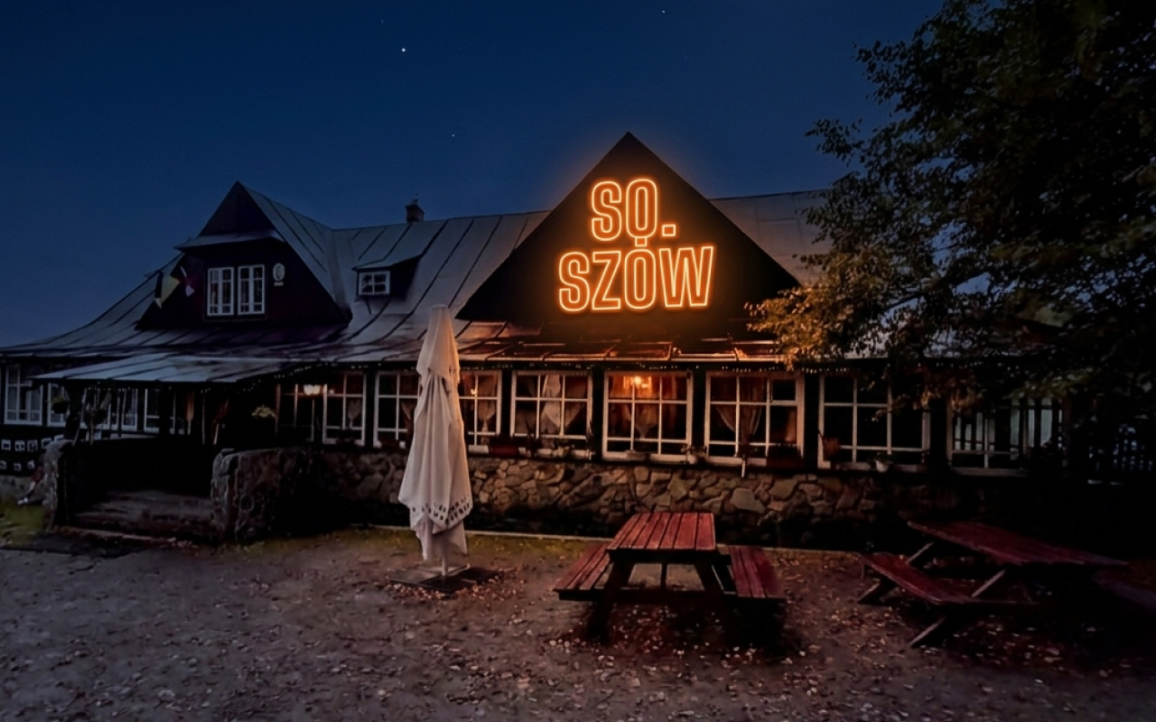
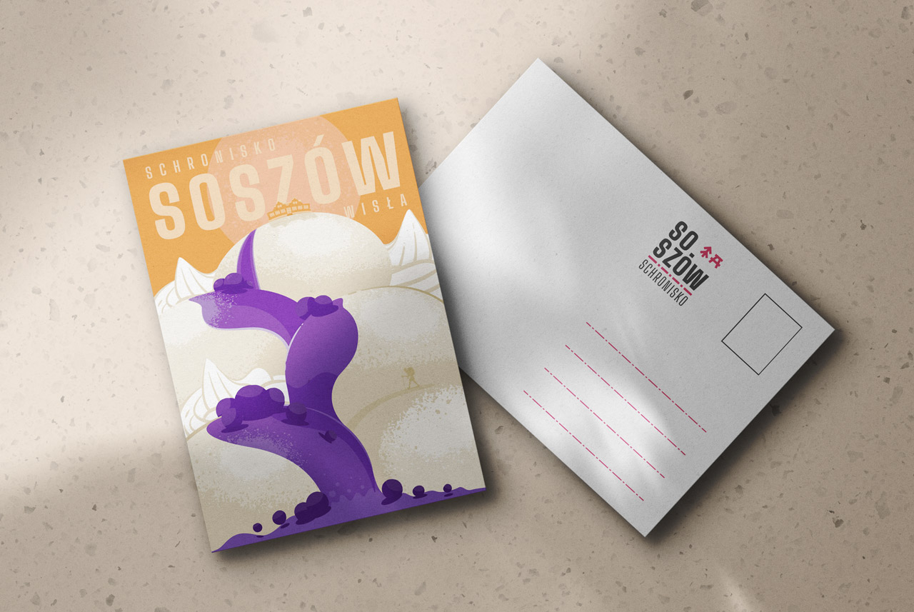
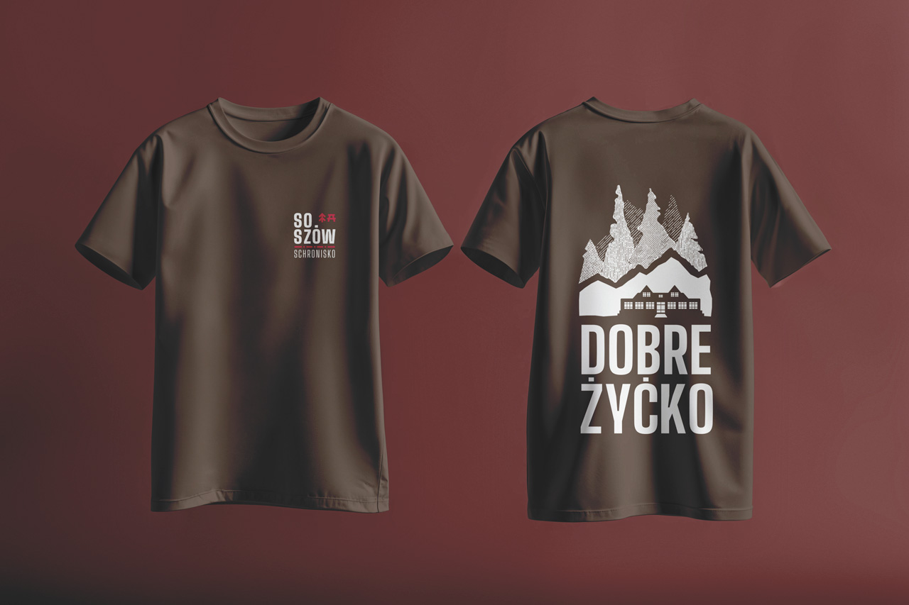
High-altitude branding demands high-impact clarity. This concept centers on the intersection of bold typography and topographic mapping, specifically referencing the shelter’s position on the iconic Red Hike Path. By pairing a sharp, modern typeface with traditional mountain motifs, we’ve created a "timeless-modern" hybrid. It’s a nod to the hikers who have passed through for decades, delivered through a visual system that feels entirely of the current moment.

The Weight of the Landscape
Version 2
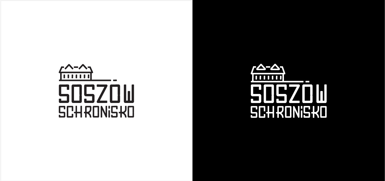
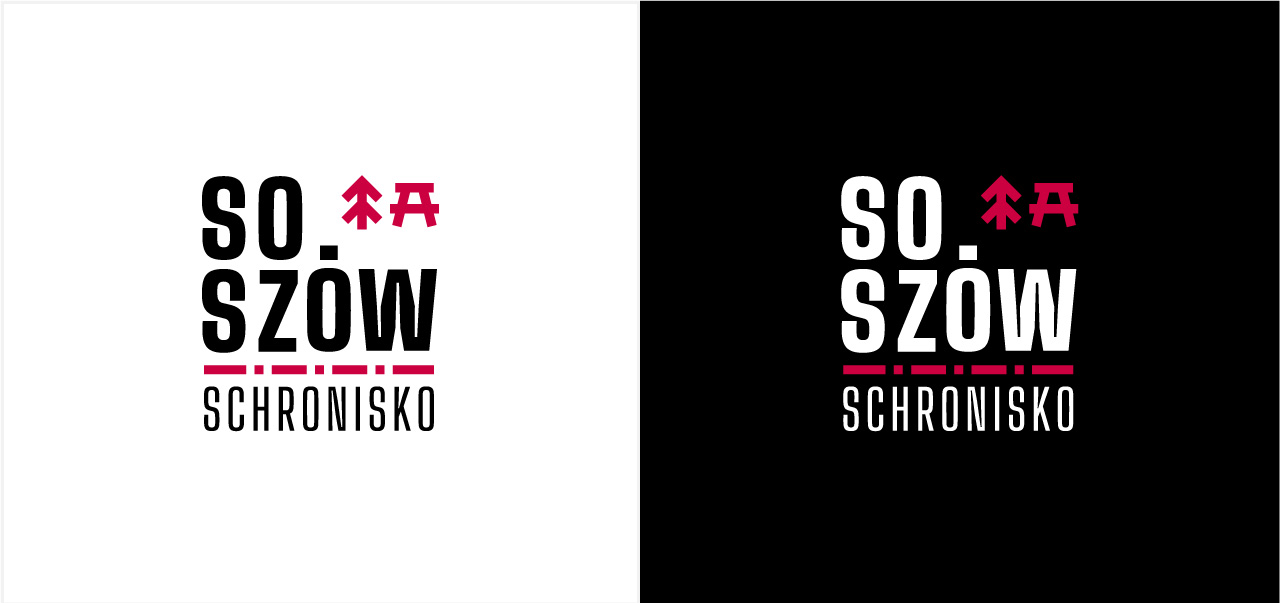
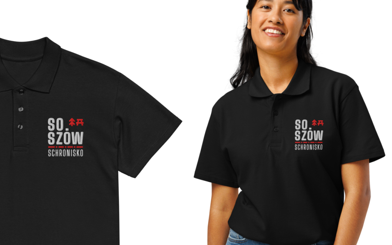
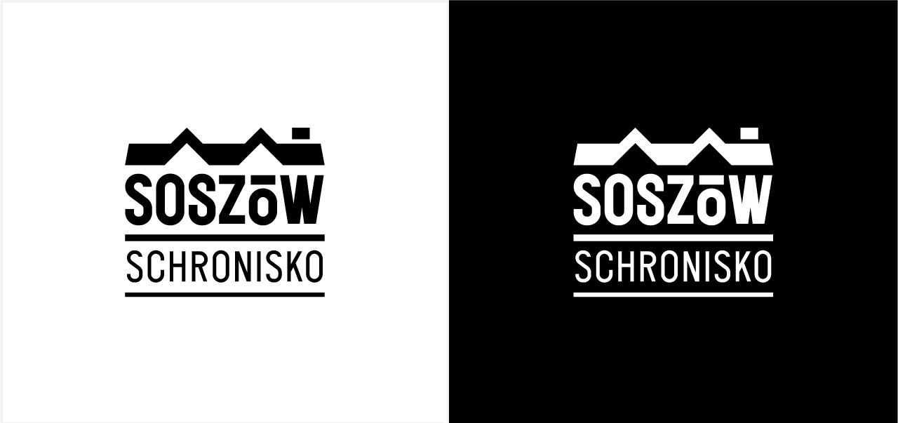
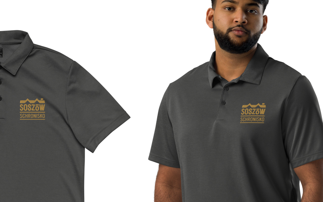
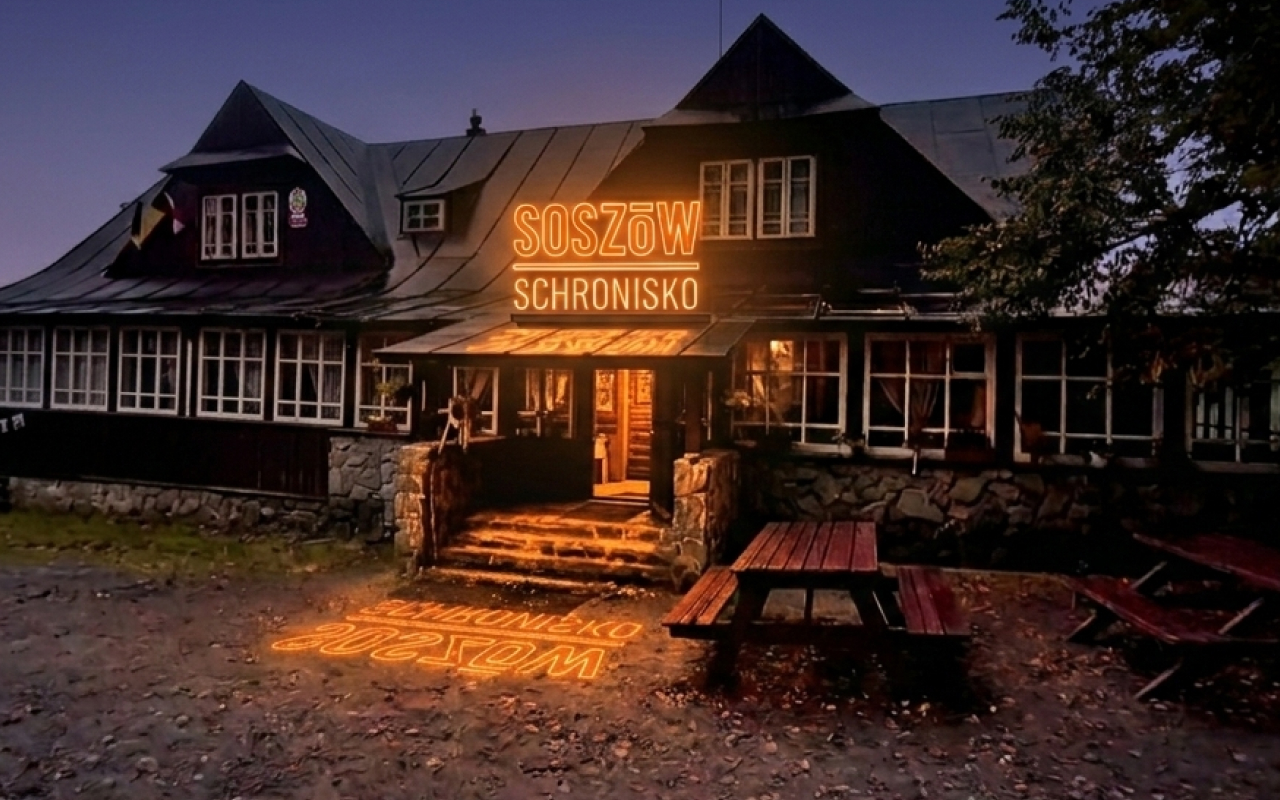
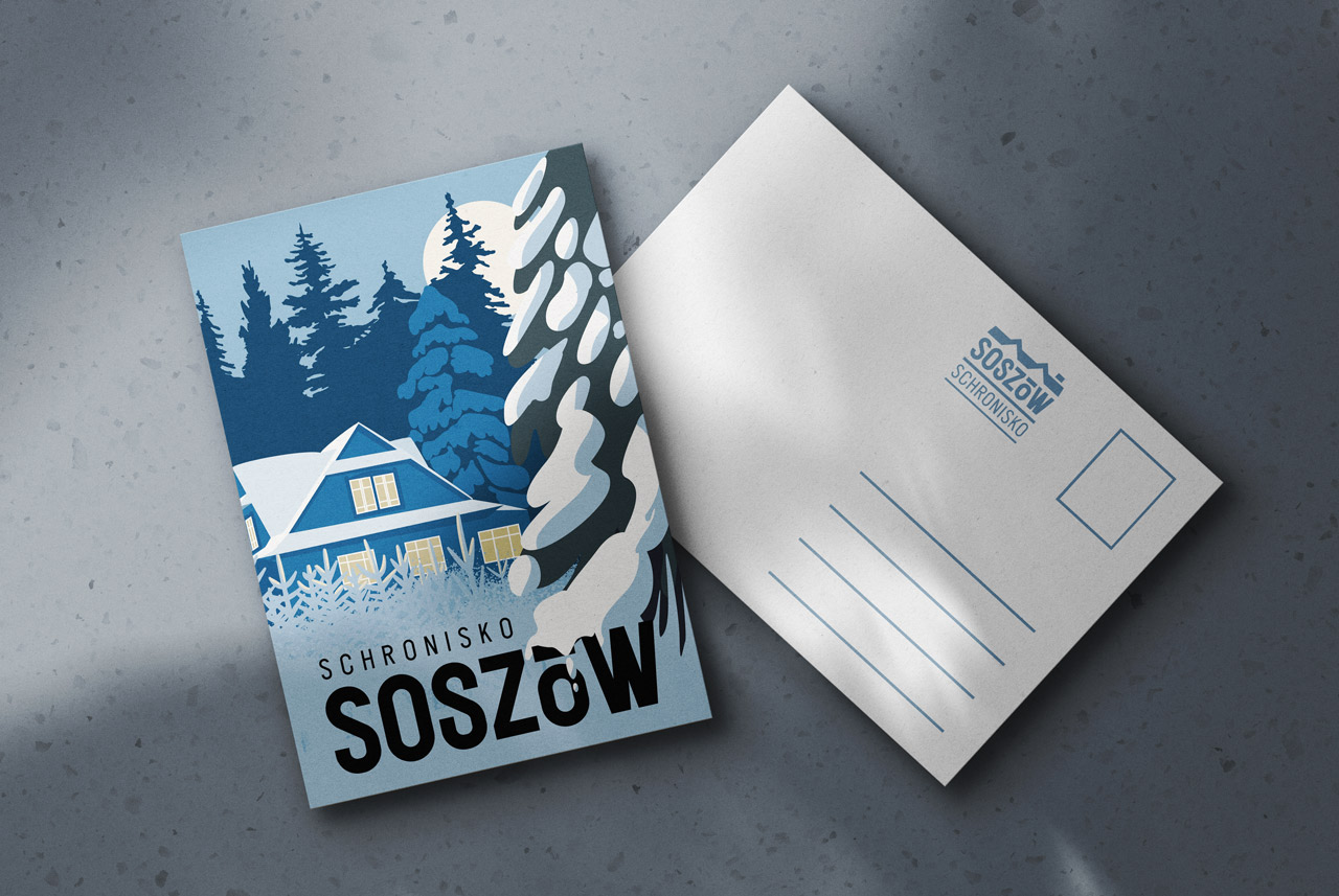
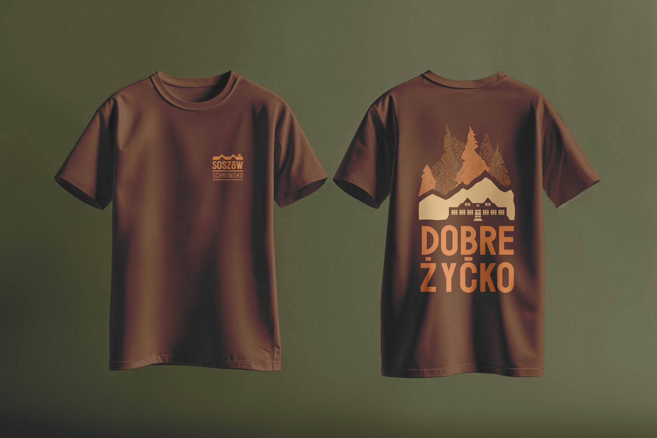
This identity is a study in contrast. By pairing the brutalist weight of the Feruka typeface with a minimalist geometric silhouette, we’ve created a mark that feels both grounded and elevated. The "Soszów" name takes center stage, demanding attention through sheer typographic mass. To balance this gravity, the branding utilizes an organic, earthy palette—pulling deep tones from the surrounding forest and stone to ensure the visual weight feels natural, not forced.
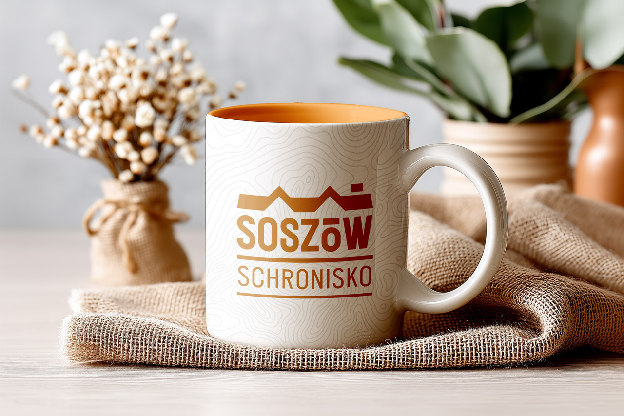
Traditional polish national park typography
Version 3
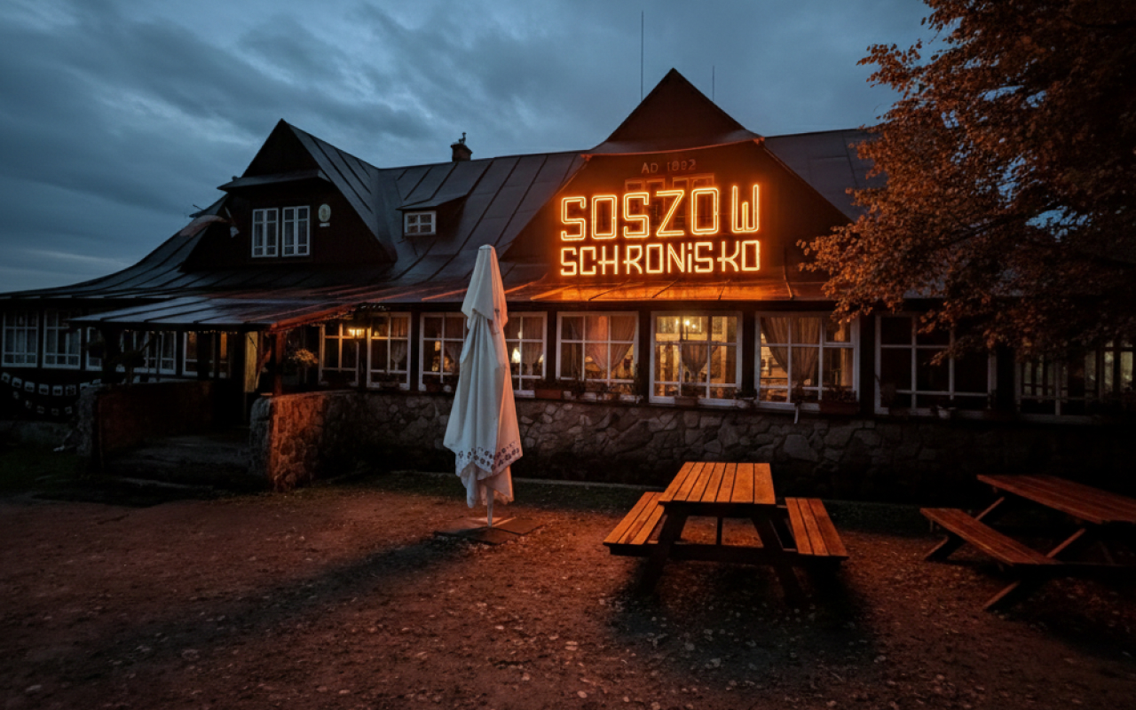
This isn't just a font; it’s the architectural soul of the forest. I’ve leaned into the high-waisted, sharp-angled geometry of that original Polish National Park lettering because it possesses a raw, folk-modernist grit that "perfect" digital faces can’t touch. It’s my top choice because it carries the weight of history—it feels carved, not just typed. In a world of sterile, forgettable branding, this traditional approach has the gravitas to actually command respect and preserve a sense of place.